I can’t even get through the above video without skipping through it, so I can’t imagine how much fun the 195 fans who turned out to the Wells Fargo Center had today watching paint dry. But, hey! The Flyers may have set a world record!
Via The 700 Level, here’s a statement from the Flyers on today’s uh… event:
It was a record-setting day at Wells Fargo Center in Philadelphia, PA, as 195 Philadelphia Flyers fans flocked to the home of their favorite National Hockey League team to watch the ice get painted in time for the upcoming 2013-14 NHL season. It is believed to be a new Guinness Book of World Record for the most people to simultaneously watch paint dry. While there is no category for the record, Comcast-Spectacor, owners of both the Flyers and Wells Fargo Center, is submitting the total to the Guinness Book of World Records for strong consideration.
Records are fun, but here’s what I’m more concerned with: Center ice still looks friggin’ dumb.
When the Wachovia Center became the Wells Fargo Center in 2010, the words “WELLS FARGO CENTER” were properly aligned on the ice like such, via FrozenFaceoff.net:


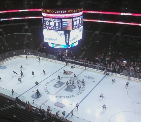
Look at that. Symmetry is a beautiful thing. It’s not as exciting as it could look, but it works. It’s fine. It’s nothing to complain about. For some reason, though, this look went about half a season … and then the Flyers decided to ditch the whole symmetry thing in favor of making my eyes bleed:


WHY IT LOOKS SO BAD WHY WHY IT MAKES NO SENSE JUST STRAIGHTEN THE WORDS OUT COME ON
When the Flyers gathered a bunch of people at the WFC today, they doubled down on the mistake:
Ice ice baby. #WFCIceMaking pic.twitter.com/YAvEZKMWuD
— Dennis Grove (@GipperGrove) August 19, 2013
It’s way down on the priority list of things to get right, of course, but there’s also no reason why the center ice design has to make me watch the game like this.
There are so many teams with nice, neat looking center ice designs. Why can’t we be one of them?


The Flyers have an awkward-shaped logo which makes things tough. Center ice will never look like the Bruins, for example, because the logo can’t fill the circle. But surely we can straighten the damn letters out. Or maybe I’ll get picky and hope for something like this?

Look how pretty. They could even make the orange there maroon/red like the Wells Fargo logo. I don’t care. It’d be different and it’d look nice and IT WOULD BE STRAIGHT. Come on, guys. Fix it.